Loading...
Title : The Obama portrait
link : The Obama portrait
The Obama portrait
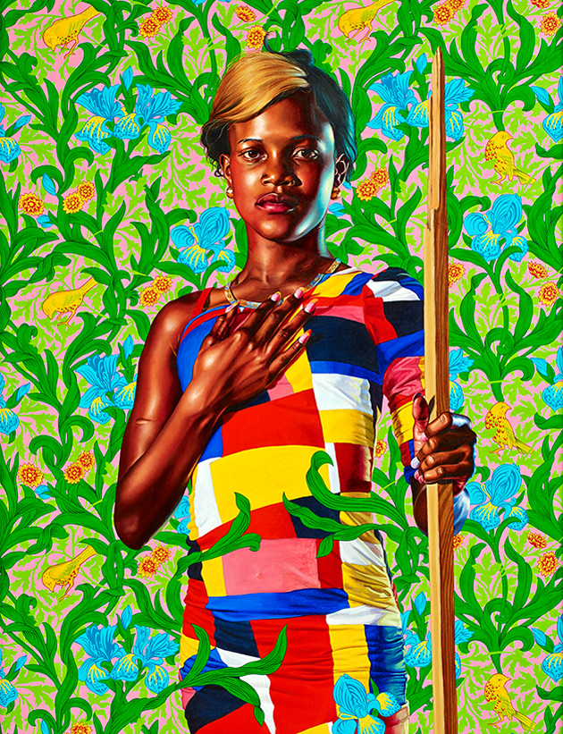
Kehinde Wiley is a great painter who takes the pains to get it right. In many respects, he reminds me of William Holman Hunt, one of my favorite artists. Wiley understands anatomy, his handling of fabric is superb, he is not afraid of detail, and he has a rare gift for marrying realism and vivid coloration.In recent years, Wiley's method -- or gimmick, if that word is permissible -- has been to place his subject against an abstract, seemingly-flat background, somewhat like a seamless vector pattern, which pops into the foreground in interesting ways. Here's an example.
Terrific piece, innit? I think it's masterful.
Unfortunately, when Wiley does "normal" backgrounds, the results are less happy. Look here.
The well-executed figure doesn't mesh at all with that poorly-painted seascape. The whole point of doing a seascape is to explore the wide variety of color one invariably sees in the water. When Wiley painted this ocean, I doubt that he opened up any tubes of paint other than Viridian. Worse, the water looks like a kind of plastic.
The biggest issue I have with this painting is the mis-match in lighting. It's supposed to be an outdoors scene, but how many suns were out that day? And why is the sun on the right radiating a cool light onto the man's skin?
Like the great cinematographers of the 1930s, Wiley loves dramatic studio lighting, with multiple light sources. This is what gives his figures such a feeling of volume, of three-dimensionality. This lighting scheme usually works well with a semi-abstract background, as in our first example, but it doesn't work when the scene is set outdoors.
Now let's look at Wiley's official portrait of President Obama.
Much is being made of the symbolic meanings of the flowers shown here. I don't care about that. Painting is not literature.
I love much in this painting, but on the whole, I just don't think it works. Once again, the studio lighting says "We are indoors" -- yet the foliage says "We are outdoors." The lights hits Obama's face from two directions, so why doesn't either light source cast any shadows beneath the chair?
Wiley tried to have it both ways in this image. The foliage is supposed to function as a semi-abstract background, as in our first example. But the foliage also reads as realism, as a three-dimensional space in the real world. The green of the leaves is reflected on Obama's suit -- so why doesn't the suited figure cast a shadow on the leaves? Why doesn't the seated figure affect his environment in any way?
I hate to criticize a work like this. The artist obviously put an enormous amount of effort and talent into it, and he really, really knows how to paint. Just look at the suit fabric: It's beautifully handled. How many times have we seen artists over-emphasize the highlights in a dark suit?
Beginning artists should look to Wiley as a model. But this piece doesn't do it for me.
Question: What should Trump's portrait look like? Oh, I would love to have a go at that. Maybe something like this, complete with bayonet mark.
Thus Article The Obama portrait
That's an article The Obama portrait This time, hopefully can give benefits to all of you. well, see you in posting other articles.
You are now reading the article The Obama portrait with the link address https://wordcomes.blogspot.com/2018/02/the-obama-portrait.html


0 Response to "The Obama portrait"
Post a Comment